World as we know it is about to change after UN vote on map of Africa’s true size
By Adam Woodward • Published: 05 Sep 2026 • 9:40 • 3 minutes read
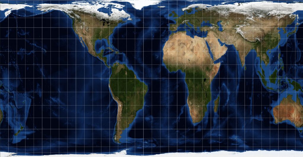
World Map drawn by Equal Map for the UN. Credit: Eugene Ga - Shutterstock
School walls, news graphics and sat-nav screens have always used the same stretched picture of Earth for generations. That picture is now under official pressure after the United Nations General Assembly backed a campaign to stop Africa looking smaller than it is.
Planeta Tierra 🌎
La ONU ha votado por la adopción de un nuevo mapa del mundo basado en la proyección Equal Earth.Esta resolución no vinculante reemplaza el mapa de Mercator (siglo XVI) para mostrar el tamaño real de los continentes, en particular el de África.
El Sudeste… pic.twitter.com/1xbc2i2PTh— Geól. Sergio Almazán (@chematierra) September 5, 2026
A resolution put forward by Togo and backed by the African Union was passed on Friday by 164 votes to one, with six abstentions. Washington cast the only no. Member states, schools, publishers and tech firms are encouraged to use maps that keep land masses in more or less a true proportion, especially the 2018 Equal Earth projection, rather than the old Mercator drawing most of us grew up with stuck to classroom walls.
It is not a new set of borders. No country physically moves. What changes is how comparatively big each continent looks on a flat page.
Why Greenland looks as big as Africa
Flemish map-maker Gerardus Mercator drew his famous chart in 1569 to help sailors. Compass bearings stay as sailing in straight lines, which is still useful at sea and in the air. Size is the price. Land near the poles gets stretched; land near the equator gets squeezed.
Greenland and Africa can look roughly the same on a Mercator wall map, which they actually are in reality. Africa is about 14 times larger. You could fit the United States, China, India, Japan, Mexico and a good chunk of Western Europe inside the African continent and still have space left over. Russia and Canada swell on the page too. Latin America and much of southern Asia shrink in the same way.
Campaigners say that visual trick has been running for 450 years in order to make the spherical Earth fit on a flat page. Children learn it early. Investors, editors and diplomats absorb it without thinking. African governments argue it has fed the idea that the continent is smaller, poorer and more marginal than its land area, population and resources warrant.
Equal Earth, drawn in 2018, keeps the area closer to the truth of actual comparative square metres while trying not to squash the look of the continents. France has already said their official maps will move away from Mercator, where size matters. Britain backed the UN text. The resolution itself says Mercator can stay for navigation purposes.
What the vote does and does not do
Nothing in the text is legally binding, as is often the case with UN resolutions. Google Maps, school publishers and tourist leaflets are not forced to reprint overnight. UN bodies and governments are asked to “favour” equal-area drawings when they want to show how big places really are.
African Union leaders see it as more than cartography. They call maps part of how a continent is judged. Supporters talk of “cartographic justice” and a fairer picture of a land mass large enough to swallow several rich-world countries at once. Opponents hear something else.
New Equal Earth map just dropped. Countries now depicted with their true relative size. pic.twitter.com/WmB8IoFu1e
— Ryan Voutilainen 🇨🇦🇫🇮 (@RyanVoutilainen) September 4, 2026
Why some think it a row about more than maps
Washington’s diplomat at the Assembly called the debate a mockery of the UN’s real job. In that telling, a 16th-century chart has been dragged into a wider political project about historical wrongs, reparations language and what officials labelled “cognitive justice”. Critics say the chamber should spend its time on wars, famine and unpaid UN bills rather than classroom posters.
Cartographers add a quieter objection. No flat map is honest in every way. Keep the area right, and you warp shape or direction. Keep compass lines straight and you warp size. Mercator still earns its keep for shipping and aviation. Switching every textbook, ministry website and phone app costs money and time. Some parents and teachers will simply ask whether a new drawing changes a single watt of electricity or a single job.
Whether a bigger-looking Africa changes how money, news and policy treat the continent is the part nobody can prove yet. Maps do not move rivers. They do train the eye. For a generation raised on a shrunken equator, that training is now officially in dispute. For those who regularly oppose high levels of African migration to Europe, this new comparative size map will no doubt give them a field day.
Follow Euro Weekly News on Google News
Get breaking news from Spain, travel updates, and expat stories directly on your Google News feed.
Follow on Google NewsSign up for personalised news
Subscribe to our Euro Weekly News alerts to get the latest stories into your inbox!
By signing up, you will create a Euro Weekly News account if you don't already have one. Review our Privacy Policy for more information about our privacy practices.


Adam Woodward
Adam is a writer who has lived in Spain for over 25 years. With a background in English teaching and a passion for music, food, and the arts, he brings a rich personal perspective to his work at Euro Weekly News. As a father of three with deep roots in Spanish life, Adam writes engaging stories that explore culture, lifestyle, and the everyday experiences that shape communities across Spain.
Comments